website design
Exploring the web design world while working on developing personal visual experience within the field of personal portfolio website.
category:
web design
type:
personal site
DATE:
january, 2022
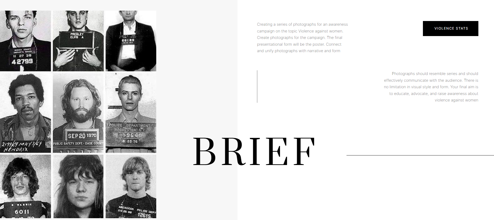
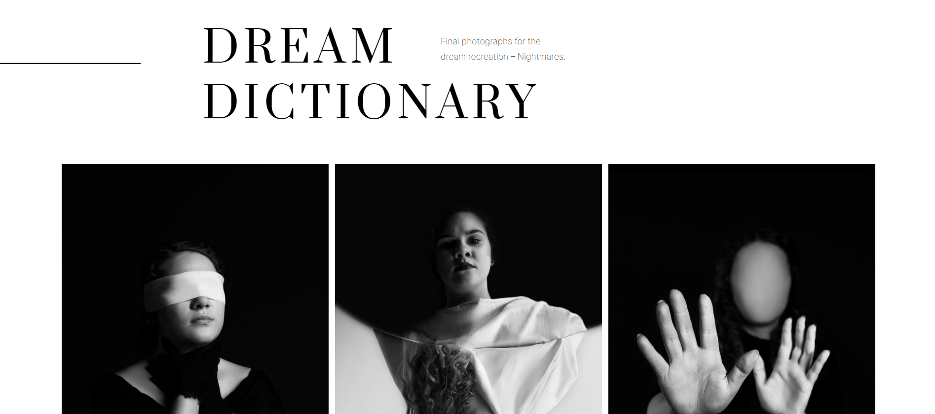
As a student of Graphic Design and Multimedia department, you have completed several of creative projects, including photography, graphic design, motion graphics etc. The aim of this project is to organize your past works into a basic portfolio built in WordPress, with the skills you have acquired so far. Focus creating firstly functional then visually appealing web site.
brief
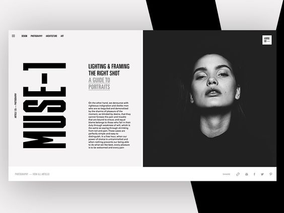
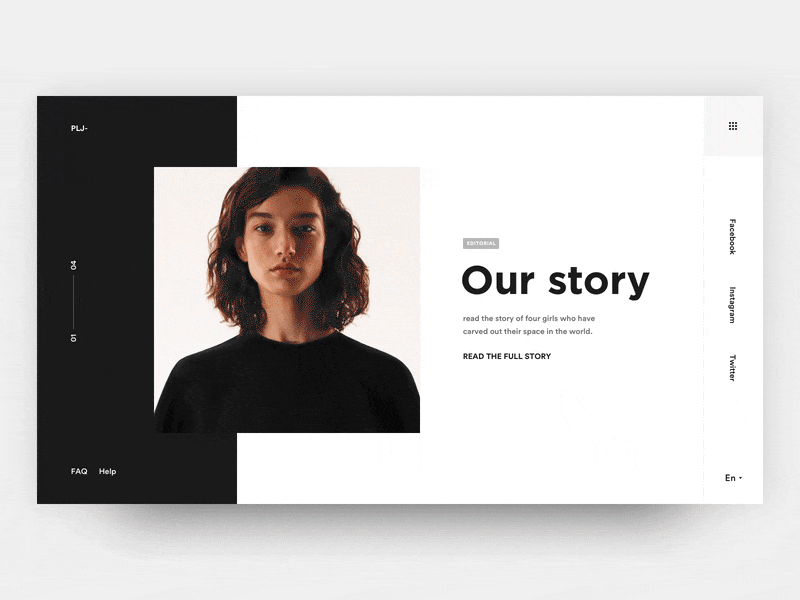
Simple approach,
pure black and
white aesthetics of
the website.
set direction
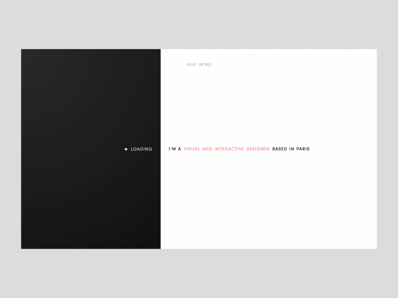
7 days ago I came to my senses and decided that I hate my previously made website and that I do not like how people might percieve me through it. I knew finally what I want to do with it and I was excited enough to start all over again only 7 days before the deadline. First relevant step for me was to set the visual direction of my website, which I was struggling previously with. For some reason, after a long period of scrolling through the pinterest I was drawn to completely simple, clean website designs. So I decided, okay if you like it that much or you think you can pull it out go with that. So the direction I decided to go with is pure black and white aesthetics, where main focus regarding the design would be the experimentation with typography.
I started the process of developing my own color palette, which in my case at least it is nothing unique or special about it. At least this portion of the work was not hard for me. I picked black and white as a base, selected two grey tones and two white tones, just to be able to experiment with them on different backgrounds, photographs etc. depending on what I will want. I then of course, uploaded the color palette in Kadance theme which will help me a lot with the productivity while working on the site.
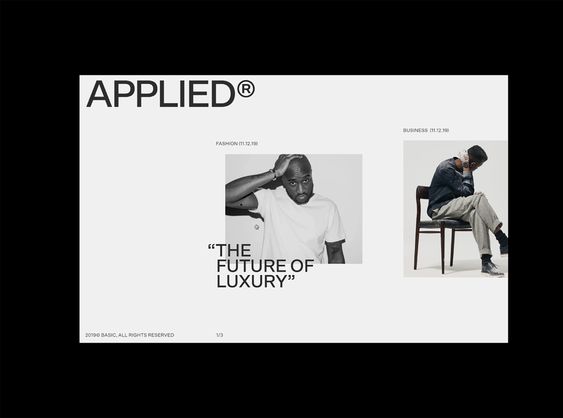
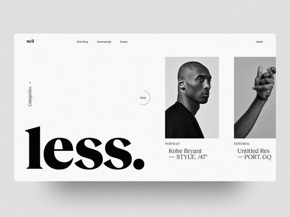
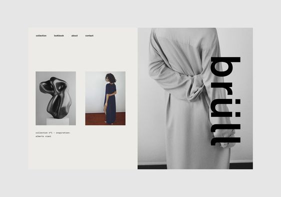
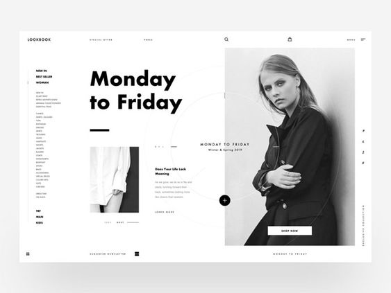
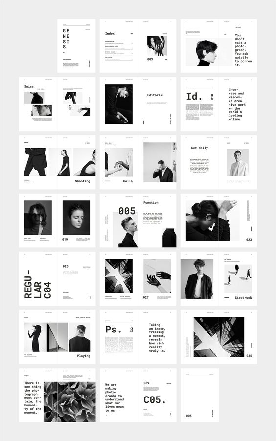
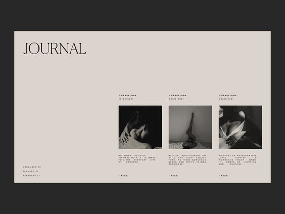
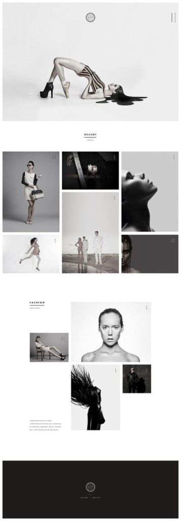
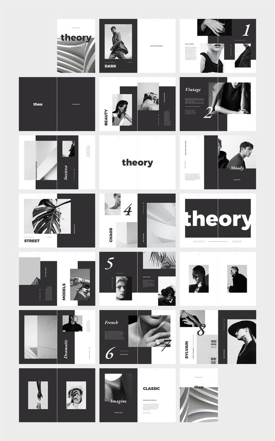
MOODBOARDING
just a few pins I put in the moodboard for website
t
y
p
e
combining two
opposing fonts
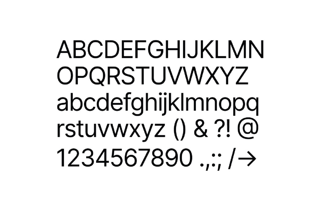
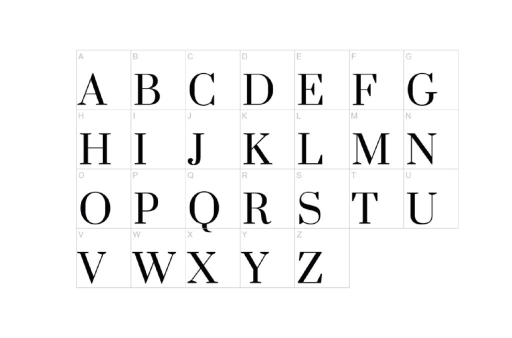
One of the most important and the hardest decision I had to make is which fonts to use for this website. I knew I wanted the combination of the serif as a main and san serif fonts, but those are challenging to combine. I went through multiple of the sites, read couple of the articles, looking for possible fonts combinations. I saved here and then the names of the fonts, downloaded them and used the Figma to see how they work together. I ended up having around 20 downloaded fonts, from which I’ve chosen the next to: Serif font I decided to use is called Prata. It is a google font that has nice looking modern serifs which I was aiming for and I combined it with famous Inter fonts which offers variety of the styles which will allow me to create the visual interest and dynamics within the website.
ty
pe
logotype.
Next stage in my website developing was setting up the new logotype, since I did not like the old one. Since I did not have much time, and from the start I knew I just want to have my name written there, because I did not still develop personal bran to justify something else, I ended up finding interesting font, which works pretty well with my name. I experimented with different weighs and tested them out on the website until i was satisfied with the this medium one. I applied it in the left corner of my header.
simple and clean
PORTFO
LIO
After everything was set, finally
the time has come to experiment
with everything I’ve prepared. I created multiple of sections.
PAGES
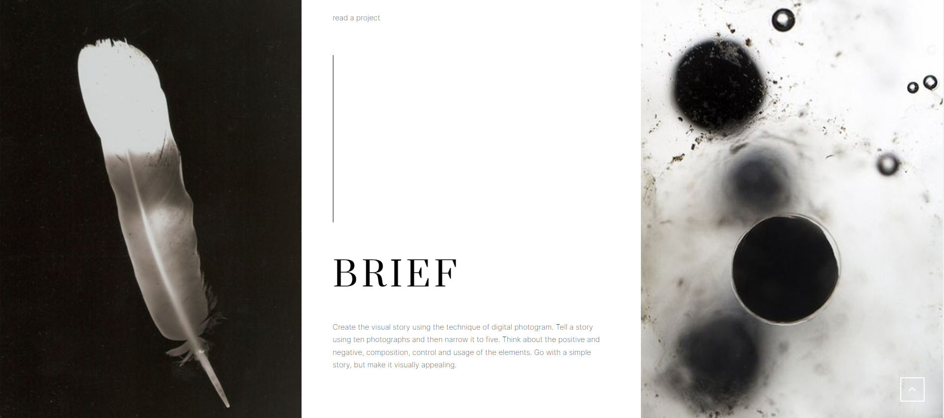
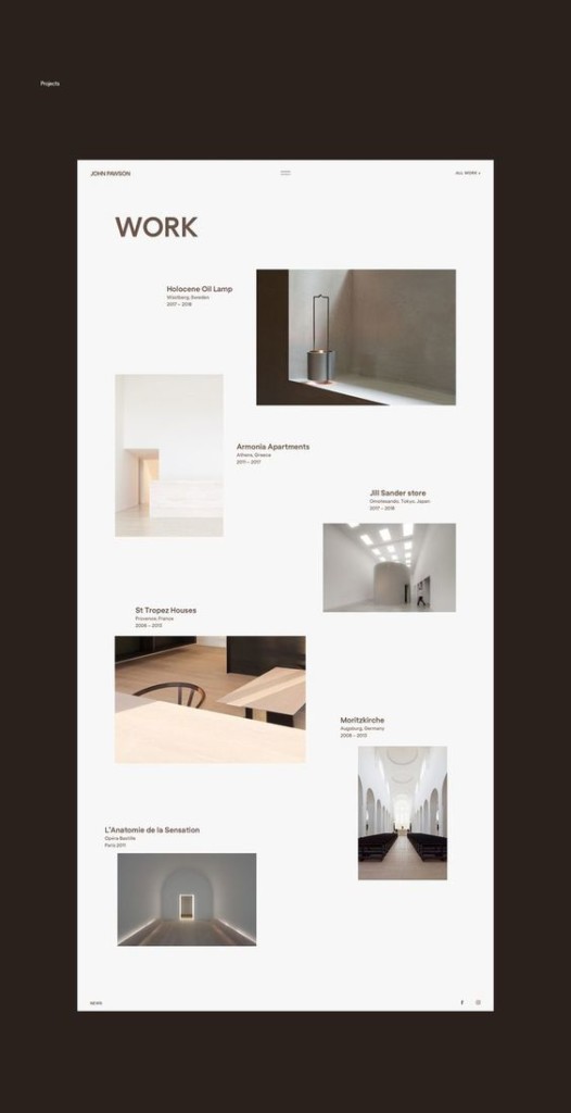
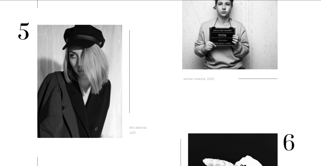
After finishing up with all portfolio pages, which resulted in creation of multiple different sections that can be combined in different ways, the harder part of the website was resolved. The next that follows are the Work, About and Contact pages, which still keep and resemble the style of individual pages. Again, additional moodboarding was done, experimenting with multiple of the pages, until I reached the final look that I considered to be the best looking out of multiple options I tried out. For the work page, I wanted to keep it nice and clean, but still create the dynamic by arranging the photographs in the following way.
next stage
With this layout I was able to keep the visual interest, and for a bit boring page, to bring it on a next level and to keep that design touch to it.
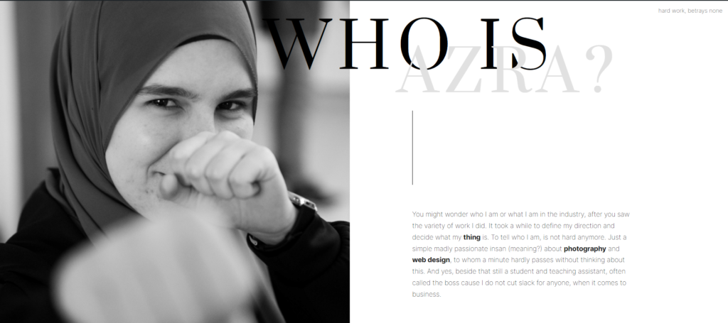
Next in line to design was about me page, for which I decided to express a bit more of my personality and tell simply few infos about myself.
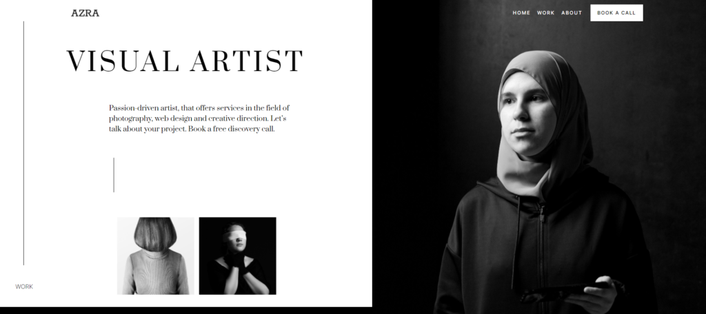
Last, but most important, I left for the end to create the hero section for my website. All rest of pages drained my energy so I struggled a bit before I reached this design that I liked.
Throughout this project I learned a lot about how important is to do the research properly to be able to work good and efficient. Everything was derived from the moodboard, and with time I was able to create directly without needing the moodboard.
The main goal behind all of this was to create something I considered good representation of me within the industry. My projects are there to showcase what my possible skills could be, that’s why I put the work from different fields.
wrap-up
One of the most demanding but still dearest project I ever did.