personal
logo design
Creating the personal logotype that reflects where I am as a designer at the time and implementing my personal visual references and style.
category:
design
type:
logotype
DATE:
january, 2020
Creating and periodically updating personal visual identity helps us position ourselves and stay in line with contemporary tendencies in design. It also says a lot about where you stand as a designer at that particular time. When starting work on this project imagine that the visual identity you create will most probably be the first creative thing your client or employer sees, an important first impression. Create the logotype to represent yourself as the designer. Your design will reflect where you are as a designer at this time as well as your personal visual and symbolic preferences.
BRIEF
c
o
n
c
e
p
t
experimentation
before the execution
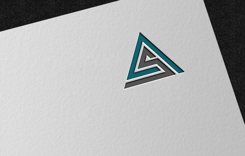
For my first logo design I decided to go with simplicity because it represents me as a person and as designer. I like to have control over what is happening, enjoy in clear design but with the dose of abstraction that can create visual interest. I used the lines to present myself as a designer because everything starts with the line same as my road in the field of design. My logo includes my two initials A and S, presented with lines going from thicker line to thinner presenting that I am at the beginning of design road and the beginnings are always hard not clear enough and how the time pass we get to learn more and get a bigger and clearer picture of what we want to do, that’s why I included the spacing between the lines at the end. Overall logo looks like letter M which refers to the mountain. Entering the new sphere of life in education feels like climbing the mountain, it takes time but when you are on the top its worth it.
logo
After I decided on the direction I am going regarding the shape I started to experiment with it. I tried different positions, lines, frames etc. until I reached the point where I liked it. After that I continued to experiment with the colors. I knew I wanted to go with dark blue as the main color, because it looks aesthetically pleasing and premium. I then decided to go with the contrasty color to the blue and went with turquoise.
read more
pro
cess
Logo conceptualization
based on the line since
every design starts with it.