alphabetic fashion editorial
Exploring a form of fashion photography in juxtaposition with typography used in the fashion industry, more specifically magazines.
category:
PHOTOGRAPHY
type:
FASHION EDITORIAL
DATE:
MARCH, 2021
EDITORIAL
Project is exploring a form of fashion photography in juxtaposition with typography used in the fashion industry, more specifically magazines. Exploring the he connection between forms of the portrait in the domain of fashion photography and find the correlation between typography and portrait. This relationship can be explored through posing, light, set design, and materialization. Project should be focusing just on portraits and single types exploring relationships of individual forms and how to connect them so they have a visual narrative. One word should be chosen and based on that world the juxtaposition should be created. Each of the photographs should resemble that word with the interaction.
b
r
i
e
f
PAIN.
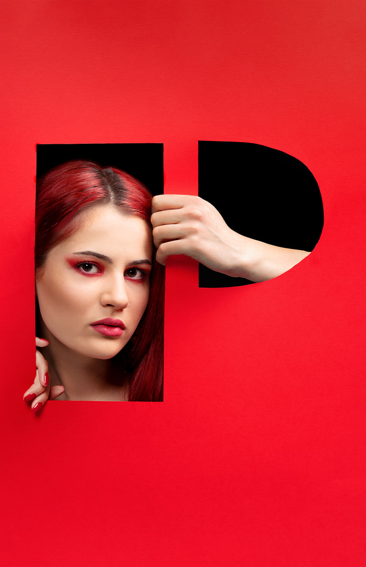
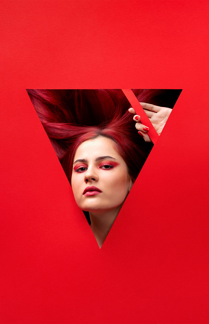
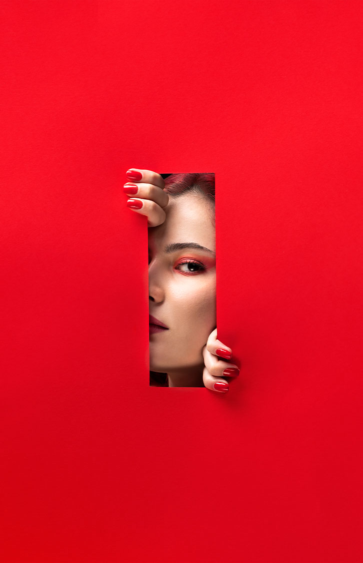
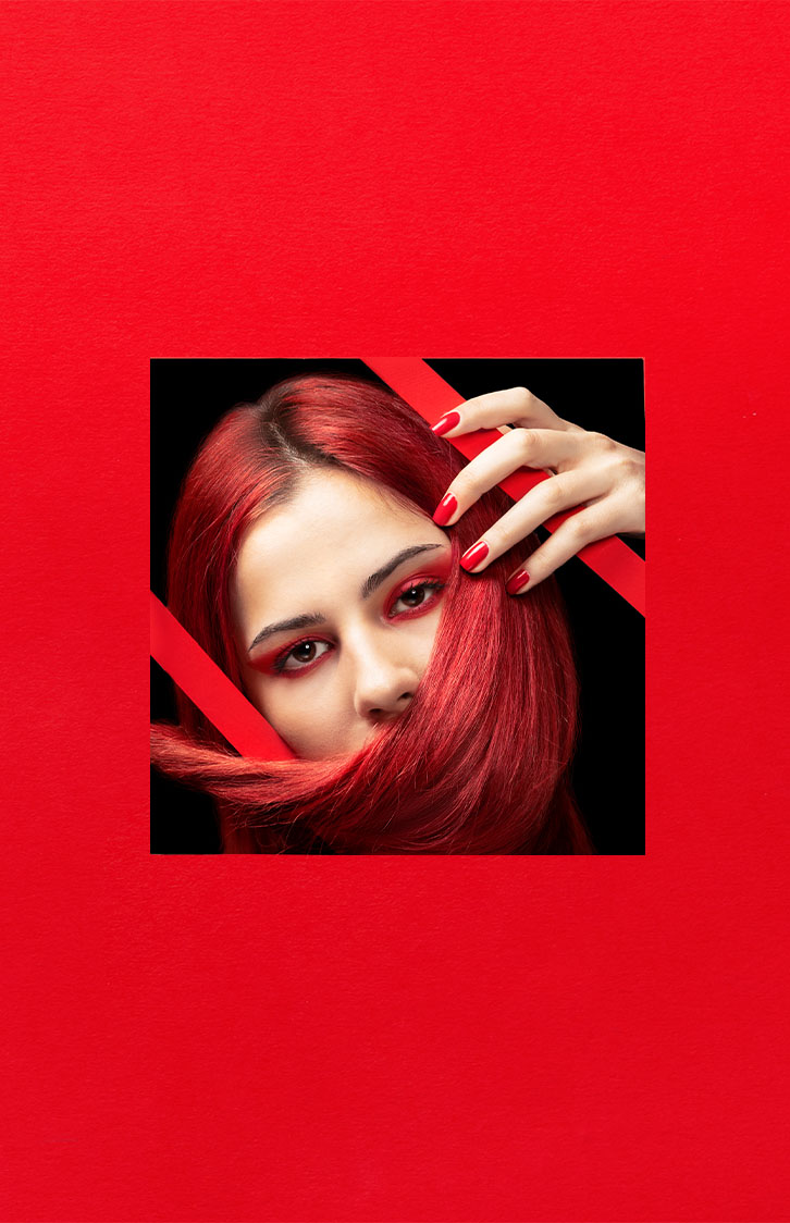
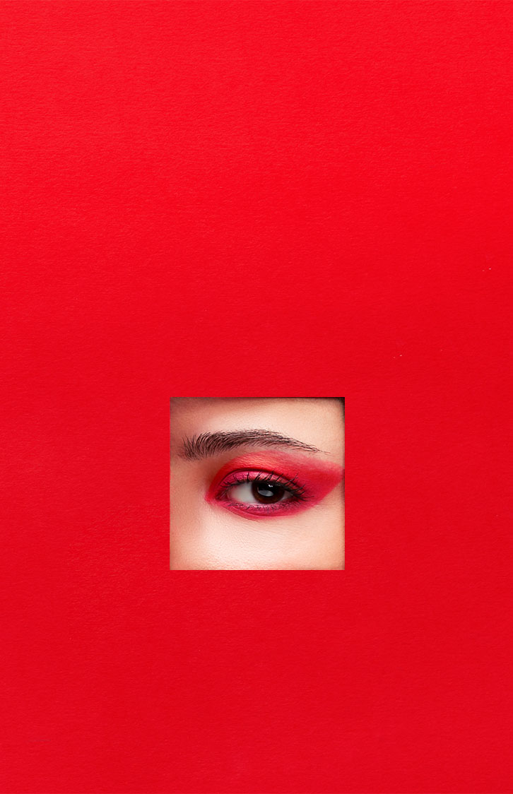
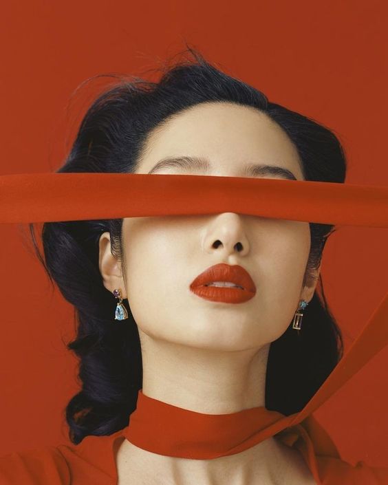
In this alphabetical fashion editorial that combines the person and alphabets I decided to take the approach of the cut out, where I would cut out the letters and let the model interact in the directed ways with the paper. For my word I decided to go with the Pain and with interaction of the model with the cutout I was visually presenting meaning of that word. Each of the photographs in the series communicates what different things the pain itself can do to a person. That’s why each of the photographs is having its own name and presents different thing. The model posing is different as well.
deeper meaning
CON
CEP
T

To be able to properly execute the cutout I decided to go with one of the Art Deco fonts which allows me to have larger areas where the model actually could be seen. Also, the look of the font itself is motivated because it has sharp edges and corners which itself visually communicates the pain. To control the aesthetics and visual value of the series I did not want to present the pain by using the facial expressions, but for the model to interact with the paper. Also, the sub concept of the visuals was beauty photography so I focused on the hair and makeup and the implementation of the color red due to its symbolism.
fashion
editorial
pain
pain expressed
with art deco and
beauty photog.